
Pictograph - Definition, Examples, Quiz, FAQ, Trivia
Learn how pictures can help us understand numbers and data!
What is a Pictograph?
A pictograph is a special way to show information using pictures or symbols instead of just numbers. It's like a chart that tells a story with images! Each picture in a pictograph represents a certain number of items.
Pictographs make data easy to understand because our brains process pictures faster than numbers. They're especially helpful for young learners who are just beginning to understand how to read graphs.
Math Fact!
The word "pictograph" comes from two words: "picto" meaning picture and "graph" meaning writing or representation.
How to Make a Pictograph
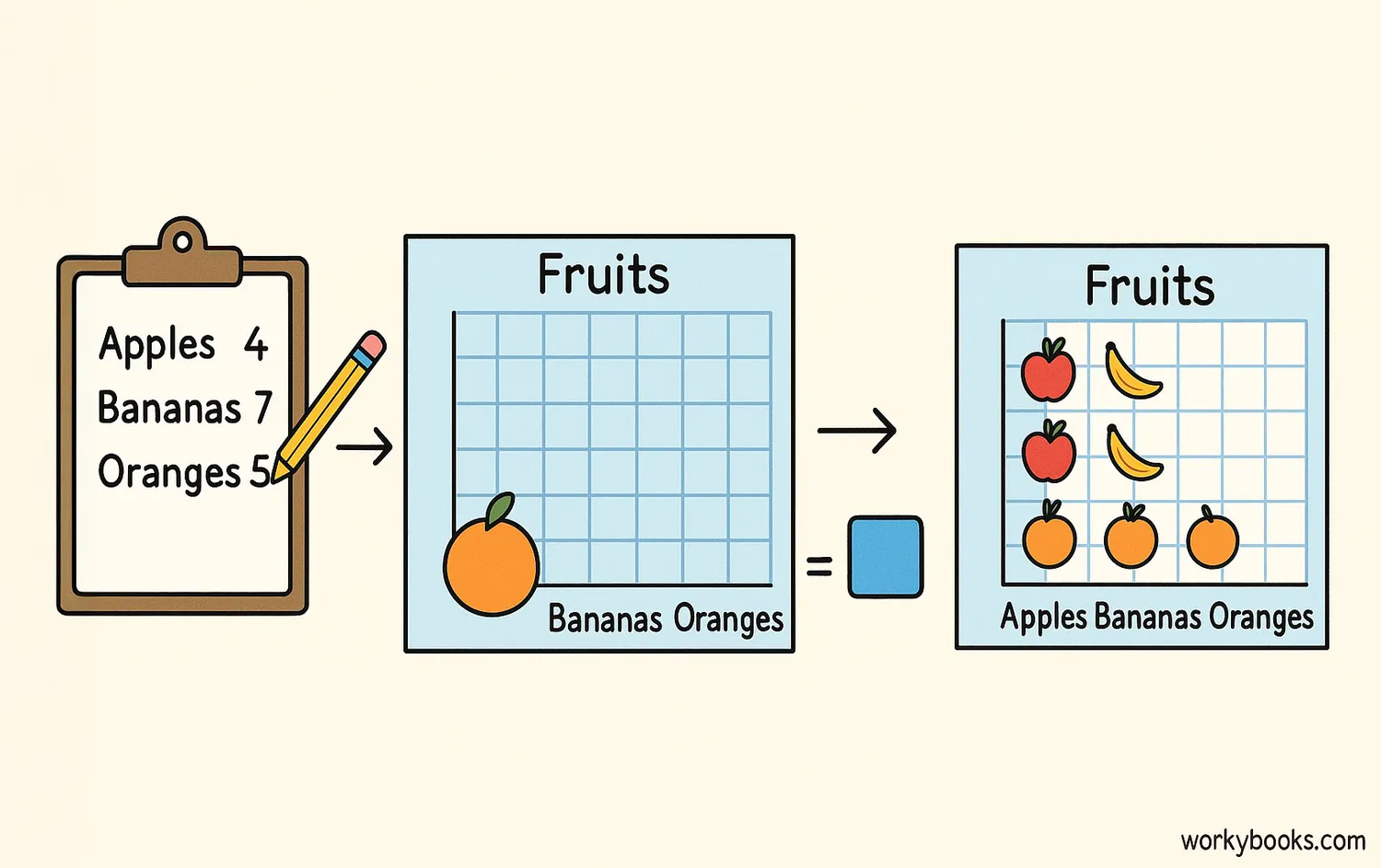
Making a pictograph is like drawing a data story! Follow these steps to create your own:
Collect Data
Gather information about what you want to show
Choose a Symbol
Pick a picture that represents your data
Decide the Value
Determine what each symbol will represent
Draw the Graph
Create your graph with titles and labels
Remember to always include a title, labels for each category, and a key that explains what each symbol represents. The key is very important because it tells readers how to interpret your pictograph.
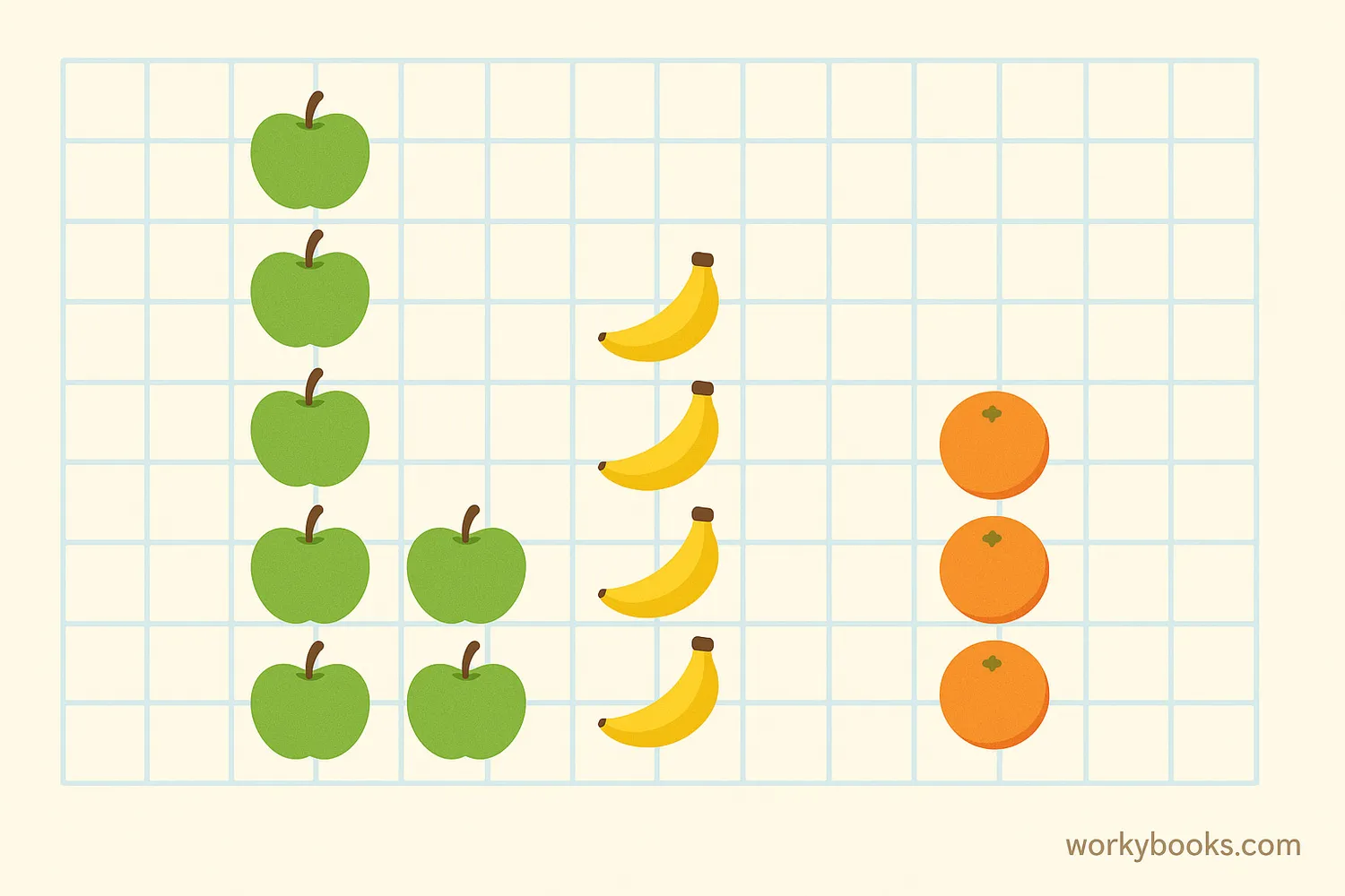
Pictograph Examples
Let's look at an example of a pictograph. Imagine we asked 20 students about their favorite pet:
Our Class's Favorite Pets
In this pictograph, we can quickly see that dogs are the most popular pet in our class. The pictures make it easy to compare the different categories without reading many numbers.
Pictograph vs Bar Graph
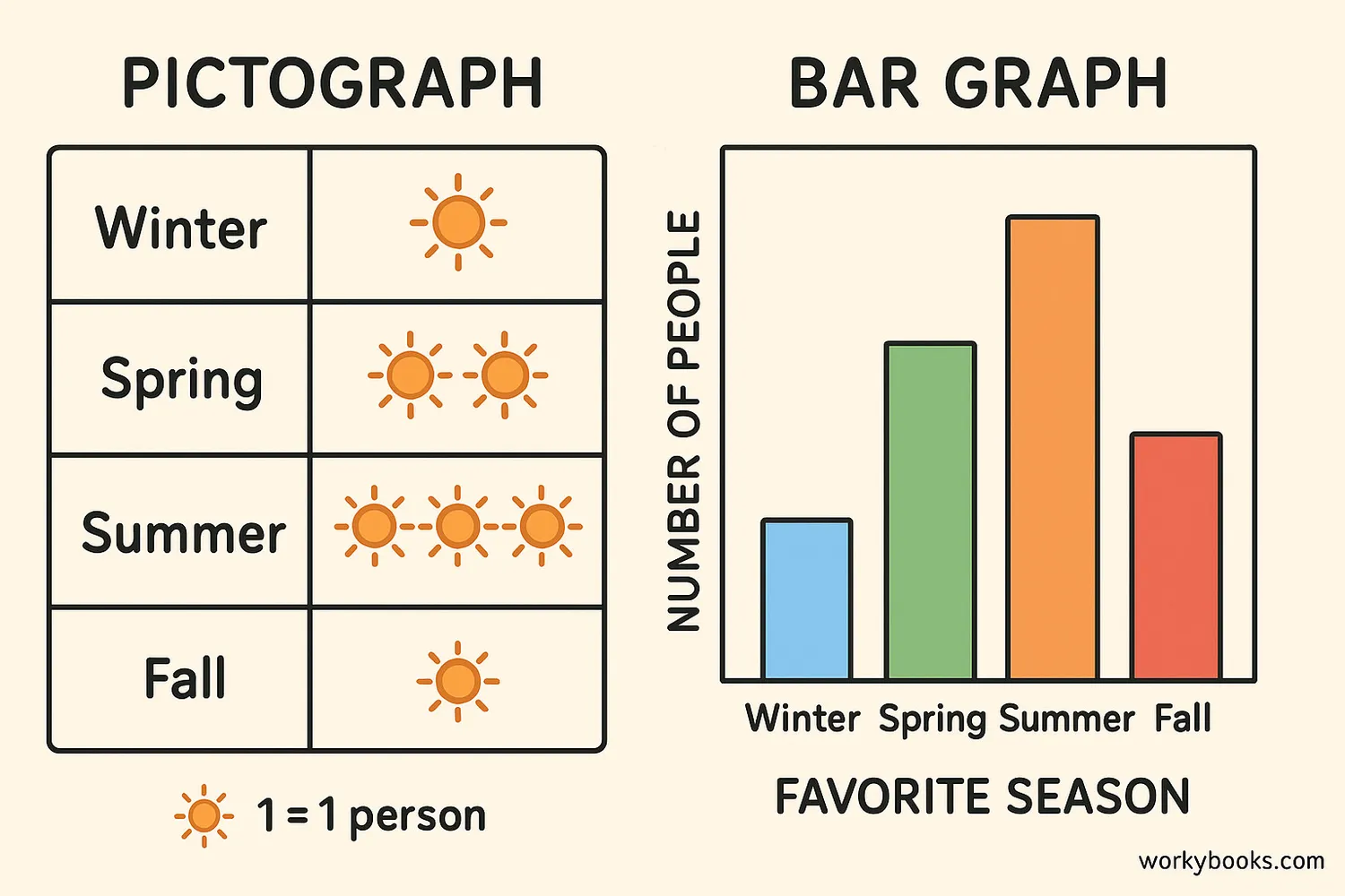
Both pictographs and bar graphs are ways to show data, but they have some differences:
Pictograph
Uses pictures or symbols to represent data
More visual and engaging for young learners
Can represent partial values with half-symbols
Bar Graph
Uses rectangular bars of different lengths
More precise for comparing exact values
Better for larger numbers and complex data
Pictographs are often better for younger students or when you want to make data more interesting and easy to understand. Bar graphs are better when you need to show exact values or compare many items.
Remember!
Both pictographs and bar graphs need a title, labels, and a scale or key to help readers understand the data.
Pictograph Quiz
Test your pictograph knowledge with this quiz! Answer all 5 questions to see how much you've learned.
Frequently Asked Questions
Here are answers to some common questions about pictographs:
Math Trivia
Discover some interesting facts about graphs and data!
Ancient Graphs
People have been using visual representations of data for thousands of years! Early cave paintings sometimes showed counts of animals, which were a very early form of pictograph.
Universal Language
Pictographs are used in many places where people might speak different languages, like airports and international events, because pictures can often be understood across language barriers.
Emoji Graphs
Today, people sometimes create pictographs using emojis on computers and phones! This modern twist makes data representation even more fun and relatable for digital natives.
Brain Power
Our brains process images 60,000 times faster than text! This is why pictographs can often communicate information more quickly than tables of numbers or paragraphs of text.
