
Data Representation - Definition, Examples, Quiz, FAQ, Trivia
Learn how to show information visually using different types of graphs and charts
What is Data Representation?
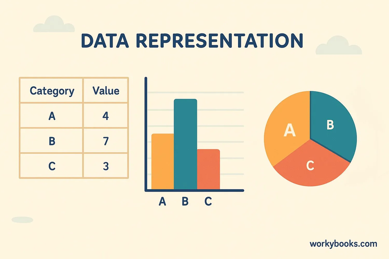
Data representation means showing information in a visual way that makes it easy to understand. Instead of just looking at numbers in a list, we can use graphs and charts to see patterns and compare different pieces of information.
Imagine you counted how many students like different fruits. You could write:
Apples: 10, Bananas: 15, Oranges: 5, Grapes: 8
Or you could make a colorful bar graph that shows this information in pictures! Which do you think would be easier to understand at a glance?
Key Concept
Graphs help us see patterns and relationships in data that might be hard to notice when looking at just numbers.
Types of Graphs
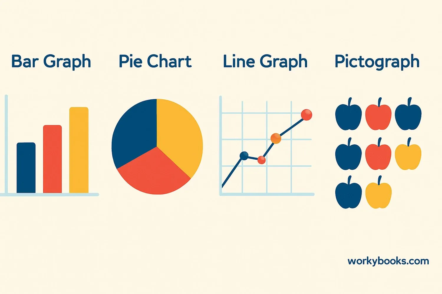
There are several types of graphs we use to represent data. Each type is good for showing different kinds of information:
Common Graph Types
- Bar Graph - Compares amounts using rectangular bars
- Pie Chart - Shows parts of a whole as slices of a pie
- Line Graph - Shows changes over time with connected dots
- Pictograph - Uses pictures or symbols to represent amounts
Bar graphs are great for comparing different categories, like favorite ice cream flavors in your class. Pie charts help us see what fraction or percentage each part makes up of the whole. Line graphs show how things change, like temperature over a week. Pictographs use fun pictures to show amounts, like apples to represent how many students brought fruit for snack.
Remember
Choose the graph type that best matches what you want to show about your data - comparison, parts of a whole, or changes over time.
Parts of a Graph
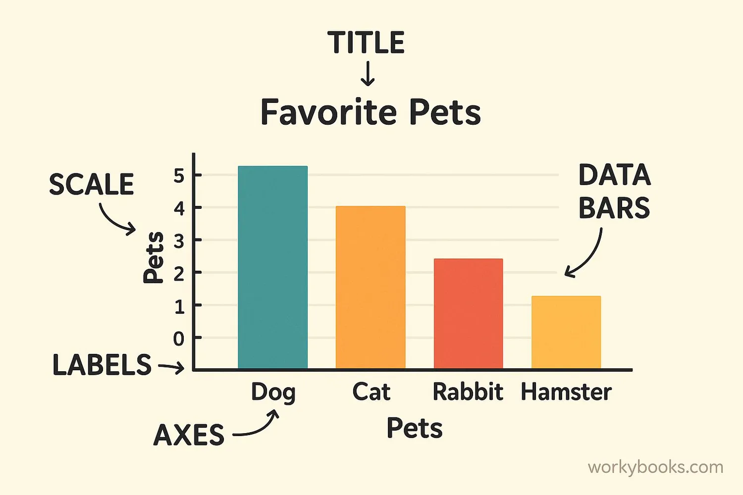
All good graphs have certain parts that help explain the information:
| Part | Purpose |
|---|---|
| Title | Tells what the graph is about |
| Axes | The horizontal (x) and vertical (y) lines that hold the scale |
| Labels | Names for each axis and categories |
| Scale | Numbers that show the amounts (like 0, 5, 10, 15...) |
| Data | The actual bars, lines, or pictures showing the information |
| Key/Legend | Explains what colors or symbols mean (especially in pictographs) |
When making your own graph, always include these parts so others can understand your information. A graph without labels or a title would be like a storybook without words - you might see pictures but not know what they mean!
Real-World Examples

Graphs aren't just for school - we see them everywhere in real life! Here are some examples:
Weather Reports: The weather channel uses line graphs to show how temperature changes throughout the day.
Classroom Elections: After voting for class president, your teacher might make a bar graph to show how many votes each candidate received.
Nutrition Labels: Some food packages have pie charts showing what percentage of your daily nutrients are in one serving.
Sports Statistics: Baseball players' batting averages are often shown in bar graphs comparing different players.
Next time you're watching TV, reading a book, or looking at food packaging, see if you can spot any graphs being used!
Data Representation Quiz
Test what you've learned with these 5 questions about representing data:
Frequently Asked Questions
Here are answers to common questions about representing data:
Data Trivia
Discover interesting facts about graphs and data representation:
Ancient Graphs
People have been using graphs for thousands of years! Ancient Egyptians used simple bar graphs to keep track of crops and supplies as early as 3000 BCE.
Pie Chart Origin
The pie chart was invented in 1801 by William Playfair, who also created the first bar graphs and line graphs. He wanted to make statistics easier to understand.
Space Graphs
NASA scientists use special 3D graphs to track spacecraft movements. These graphs help them calculate exactly where spacecraft are in space at any moment.
Biggest Graph
The largest graph ever made was a bar graph on a football field showing internet usage statistics. It was over 100 yards long with bars up to 20 feet tall!
