
Graphs - Definition, Examples, Quiz, FAQ, Trivia
Learn how graphs help us understand information with easy explanations, examples, and activities
What is a Graph?
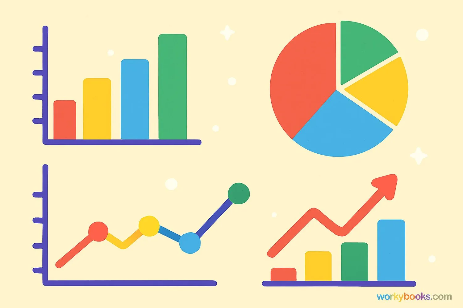
A graph is a visual way to show information or data. Instead of just writing numbers, we can use pictures, bars, lines, or circles to help people understand the information quickly.
Graphs help us see patterns, compare things, and understand large amounts of information more easily. They turn numbers into pictures that tell a story about the data.
Think of graphs as a special language that helps us "see" numbers. Just like you use pictures in a storybook to understand the story better, graphs use visual elements to help us understand data.
Key Concept
Graphs are visual representations of data that make information easier to understand and compare.
Types of Graphs
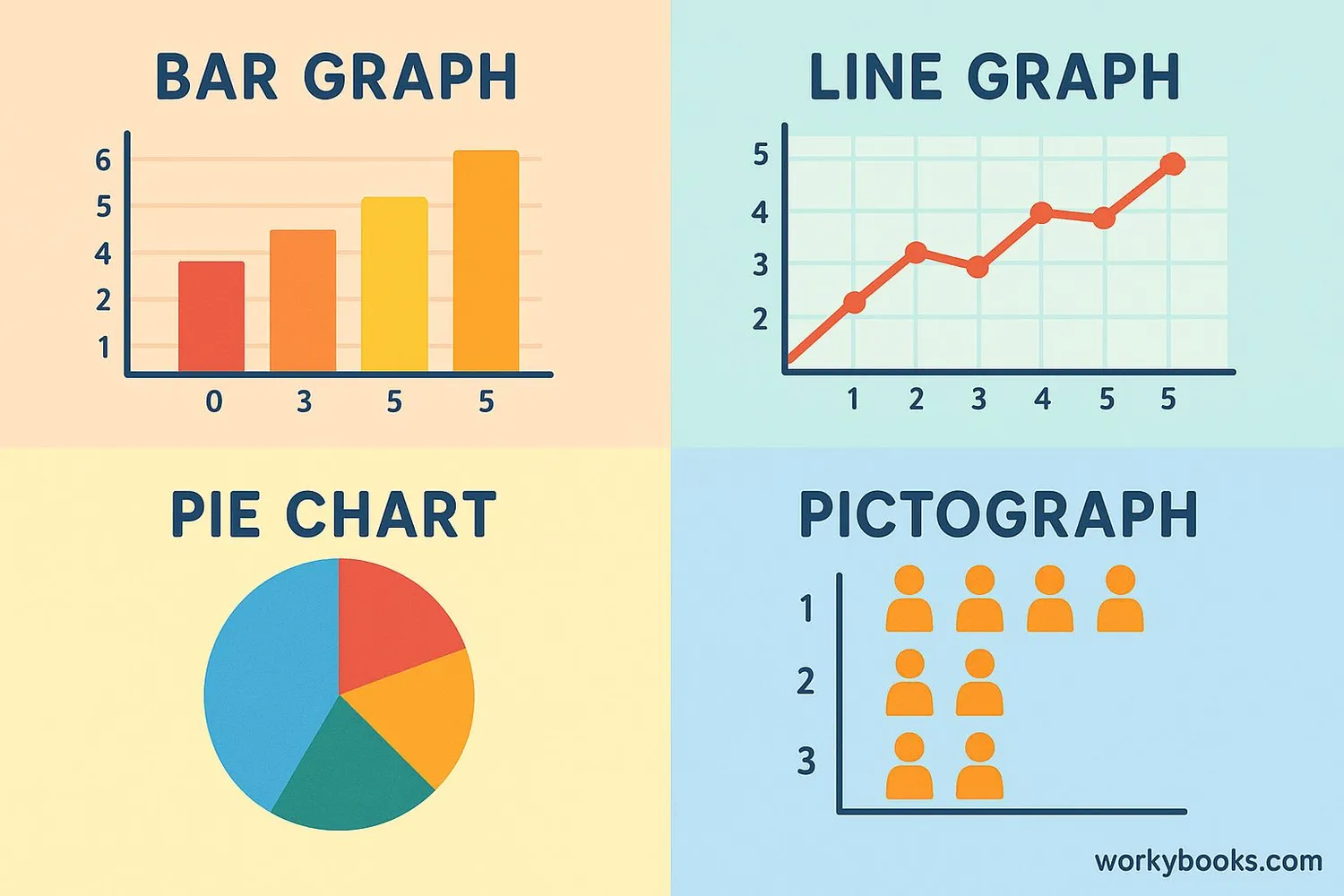
There are several types of graphs, each good for showing different kinds of information:
Bar Graph
Uses rectangular bars to show amounts. The taller the bar, the larger the amount. Great for comparing different categories.
Line Graph
Uses points connected by lines to show how values change over time. Perfect for showing trends.
Pie Chart
Shows parts of a whole as slices of a circle. Each slice represents a portion of the total amount.
Pictograph
Uses pictures or symbols to represent data. Each picture stands for a certain number of items.
Remember
Different graph types are better for different kinds of information. Choose the one that best shows what you want to explain.
How to Read a Graph
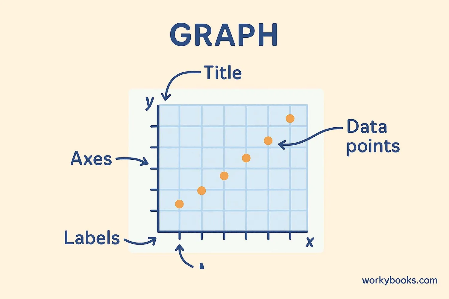
Reading a graph is like reading a map - you need to understand what each part means. Here's how to read most graphs:
1. Look at the title - It tells you what the graph is about.
2. Check the labels - The words along the bottom and side tell you what each axis represents.
3. Understand the scale - The numbers show the values being measured.
4. Look for a key or legend - This explains what different colors or symbols mean.
Let's practice with an example: A bar graph showing favorite ice cream flavors.
The title might be "Favorite Ice Cream Flavors in Our Class." The bottom might have flavors like chocolate, vanilla, strawberry. The side would have numbers showing how many students chose each flavor.
Reading Tip
Always start with the title and labels to understand what the graph is showing before looking at the data.
Real-World Examples
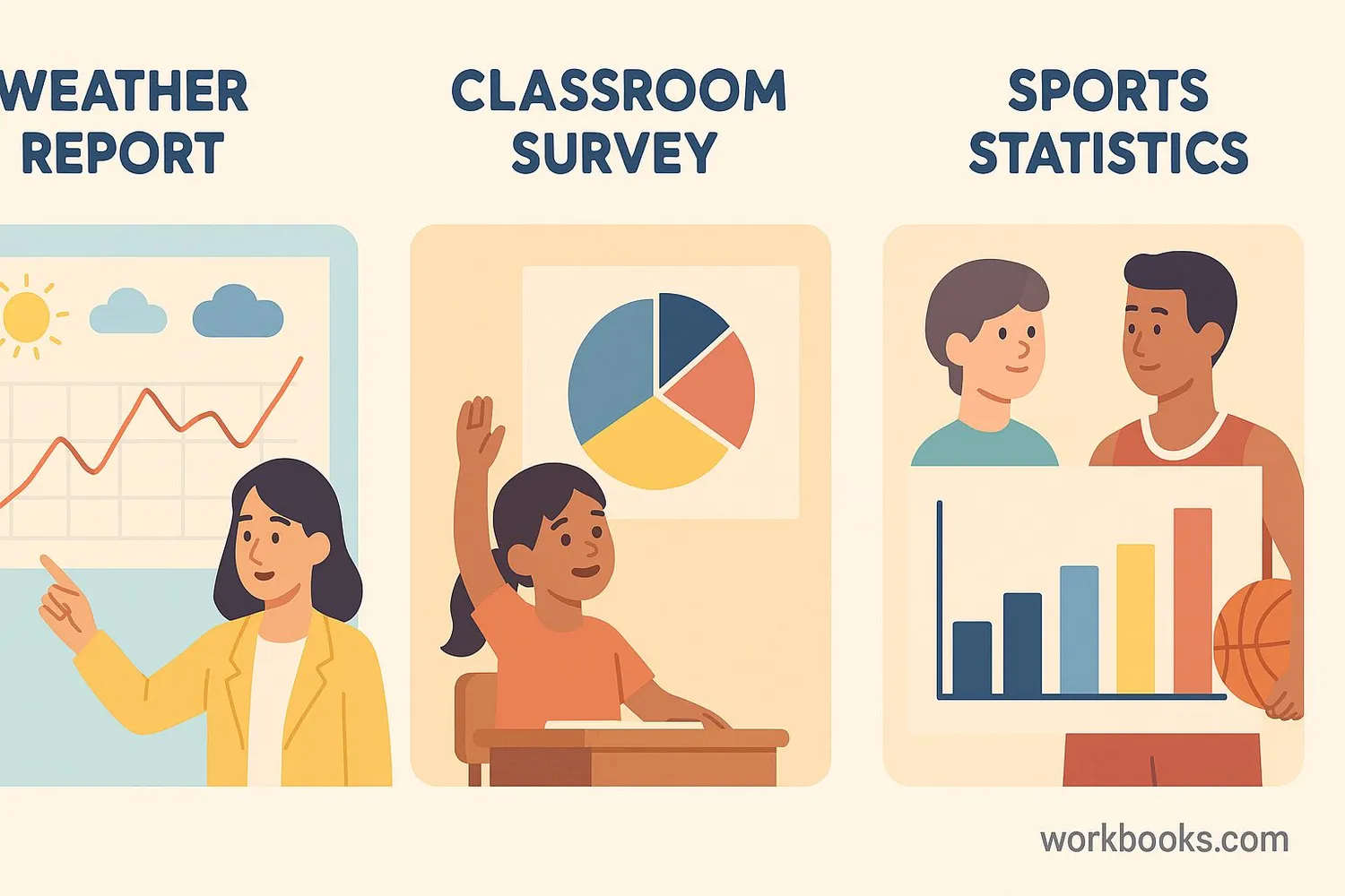
Graphs are used everywhere in our daily lives. Here are some examples:
Weather reports use line graphs to show temperature changes throughout the day or week.
Classroom surveys often use bar graphs or pictographs to show favorite foods, pets, or activities.
Sports statistics use various graphs to show player performance, game results, and team comparisons.
Nutrition labels sometimes use bar graphs to show the percentage of daily nutrients in food.
Growth charts at the doctor's office use line graphs to track how children are growing over time.
Real-World Connection
Look for graphs in newspapers, on TV news, in books, and online. You'll be surprised how often they're used!
Graph Knowledge Quiz
Test your understanding of graphs with this 5-question quiz. Choose the correct answer for each question.
Frequently Asked Questions
Here are answers to common questions about graphs:
Graph Trivia
Discover interesting facts about graphs and data visualization:
Ancient Graphs
The first known graphs were created in the 17th century, but people have been visualizing data for thousands of years. Ancient Egyptians used visual representations to track Nile River flood levels.
Pie Chart Origin
The pie chart was invented by William Playfair in 1801. He was a Scottish engineer and political economist who created several types of graphs we still use today.
Brain Power
Our brains process visual information 60,000 times faster than text. This is why graphs are so effective at helping us understand data quickly!
Largest Bar Graph
The world's largest bar graph was created in 2013 in Germany. It was over 100 meters long and showed environmental data about energy consumption.
