
Line Graphs - Definition, Examples, Quiz, FAQ, Trivia
Learn to visualize data with line graphs through clear explanations and practice activities
What is a Line Graph?
A line graph is a type of chart that displays information as a series of data points connected by straight line segments. It's used to show how data changes over time.
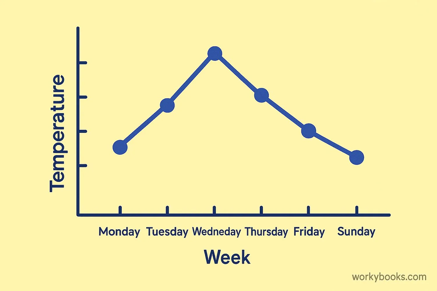
Line graphs are helpful because they make it easy to see trends and patterns. For example, you can use a line graph to show how temperatures change throughout the week, how a plant grows over time, or how many books you read each month.
The line graph was popularized in the 18th century by William Playfair, who used them to show economic data. Today, they're one of the most common ways to display data that changes over time.
Key Concept
Line graphs show how data changes over time, making it easy to spot trends and patterns.
Parts of a Line Graph
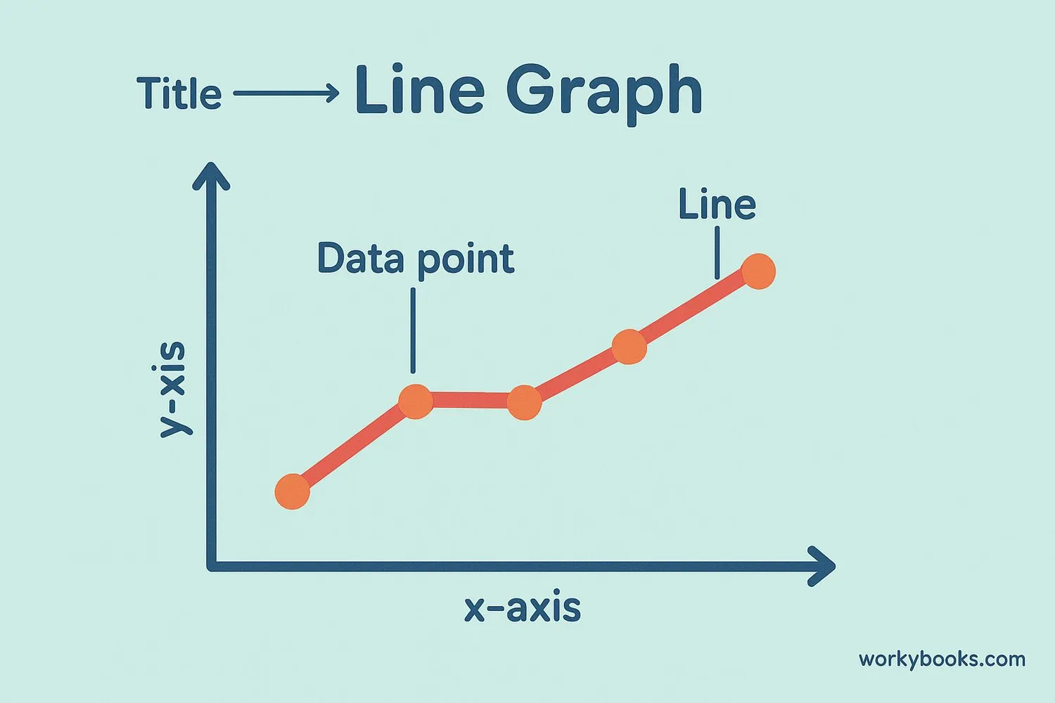
Every line graph has several important parts:
Title: Tells what the graph is about
X-axis: The horizontal line (usually shows time or categories)
Y-axis: The vertical line (shows the values or measurements)
Data points: The dots that represent specific values
Line: Connects the data points to show the trend
Labels: Explain what each axis represents
Scale: The numbers on each axis that help us read the values
When you create a line graph, it's important to include all these parts so others can understand your data.
Remember
Always include a title, labeled axes, and a consistent scale when creating line graphs.
How to Make a Line Graph
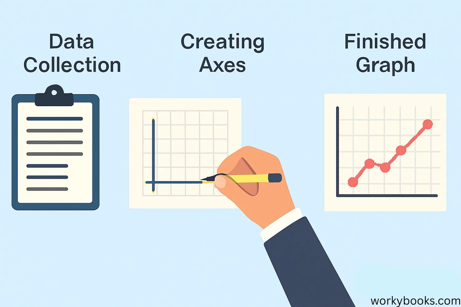
Creating a line graph is a simple process when you follow these steps:
1. Collect your data: Gather the information you want to graph
2. Draw your axes: Draw two lines that meet at a right angle
3. Label the axes: Write what each axis represents (often time on the x-axis)
4. Create a scale: Decide on appropriate numbers for each axis
5. Plot your points: Mark each data point on the graph
6. Connect the points: Draw lines between the data points
7. Add a title: Give your graph a descriptive title
Let's practice with an example: Tracking the number of apples sold each day for a week.
Data Table Example
| Day | Apples Sold |
|---|---|
| Monday | 10 |
| Tuesday | 15 |
| Wednesday | 12 |
| Thursday | 18 |
| Friday | 25 |
| Saturday | 30 |
| Sunday | 20 |
Pro Tip
Use a ruler to make straight lines and space your data points evenly for a neat, professional-looking graph.
Types of Line Graphs
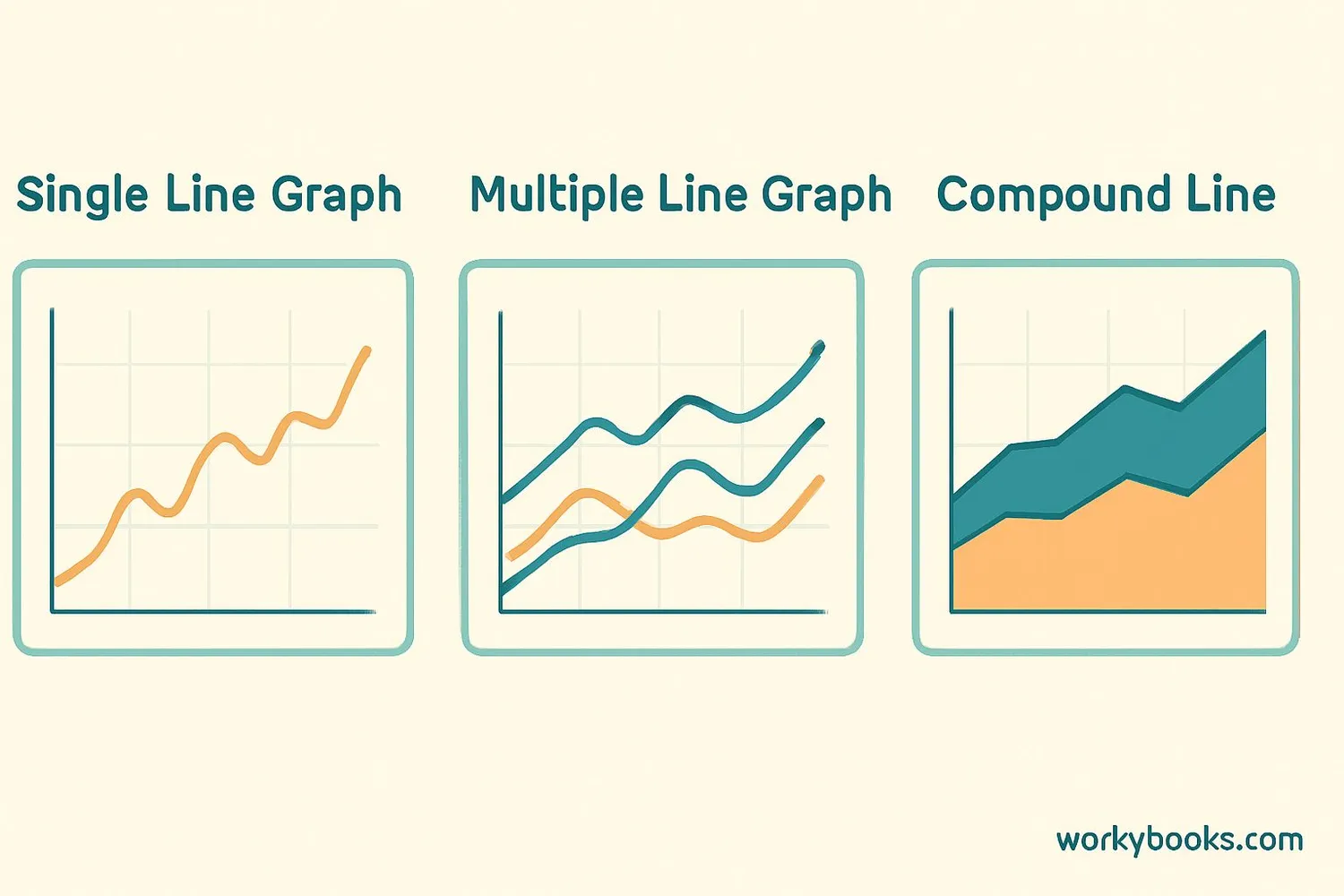
There are several types of line graphs that serve different purposes:
Simple Line Graph: Shows one set of data with a single line
Multiple Line Graph: Shows two or more sets of data with different colored lines
Compound Line Graph: Shows how parts of a whole change over time
3D Line Graph: Shows data in three dimensions (less common)
Each type has its own advantages. Simple line graphs are great for showing basic trends, while multiple line graphs let you compare different datasets. Compound line graphs help you see how components contribute to a total.
When to Use
Use multiple line graphs when you want to compare different datasets that share the same x and y axes.
Line Graph Examples

Line graphs are used in many real-world situations:
Weather Forecasting: Meteorologists use line graphs to show temperature changes over time.
Stock Market: Investors use line graphs to track how stock prices change.
Science Experiments: Scientists use line graphs to display their results.
Health Tracking: Doctors use line graphs to show changes in patients' health.
Here's an example of how you might use a line graph in your daily life:
Imagine you want to track how many minutes you read each day for a week. You could create a table of your data, then make a line graph to see if your reading time is increasing, decreasing, or staying the same.
Weekly Reading Time
Practice Idea
Create a line graph showing your height each year or the average temperature each month.
Line Graph Quiz
Test your knowledge about line graphs with this 5-question quiz. Choose the correct answer for each question.
Frequently Asked Questions
Here are answers to common questions about line graphs:
Data Visualization Trivia
Discover interesting facts about data visualization and graphs:
First Line Graph
The first known line graph was created in the 10th century by an unknown mathematician. However, the modern line graph was popularized by William Playfair in his 1786 book "The Commercial and Political Atlas."
Brain Processing
Our brains process visual information 60,000 times faster than text. This is why graphs and charts are so effective for communicating complex data quickly and clearly.
Longest Line Graph
The longest line graph ever created was over 1,000 feet long, displaying 100 years of stock market data. It was created by financial analysts to study long-term market trends.
Digital Revolution
Before computers, creating graphs required careful hand-drawing. Today, software can create complex line graphs in seconds, making data visualization accessible to everyone.
