
Line Plots - Definition, Examples, Quiz, FAQ, Trivia
Learn to create and read line plots with simple explanations, examples, and practice activities
What is a Line Plot?

A line plot (also called a dot plot) is a simple way to show how many times each value in a set of data occurs. It uses a number line with dots or X marks above each value to show its frequency.
Think of a line plot as a special graph that helps us see patterns in data. For example, if we surveyed our class about how many pets each student has, a line plot would show us the most common number of pets at a glance.
Line plots are great for showing small sets of data clearly. They help us answer questions like:
- What is the most common value?
- What is the least common value?
- How many data points are there?
- What is the range of the data?
Key Parts of a Line Plot
- Title: Tells what the data is about
- Number Line: Shows all possible values
- Dots/X Marks: Each represents one data point
- Scale: The intervals on the number line
How to Make a Line Plot
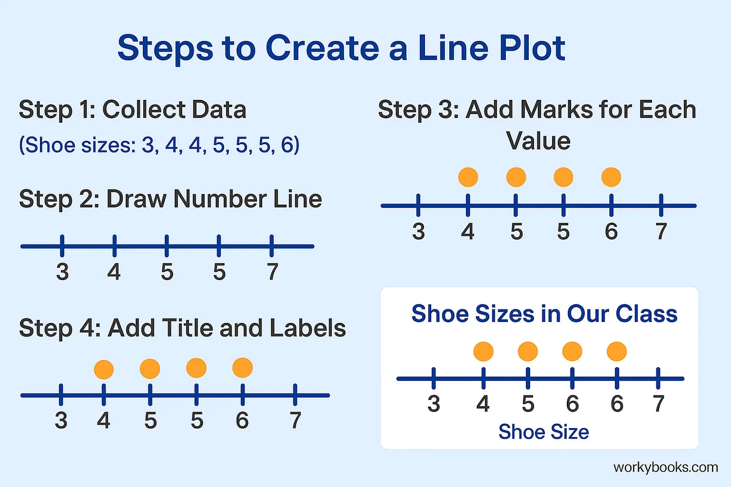
Creating a line plot is simple! Just follow these steps:
Step 1: Collect your data
First, gather the information you want to show. For example, how many books each student read last month.
Step 2: Make a number line
Draw a horizontal line and mark the possible values from the smallest to the largest number in your data.
Step 3: Add marks above each number
For each data value, place a dot or X above its number on the line. If a number appears multiple times, stack the marks above it.
Step 4: Add a title and labels
Give your line plot a title that explains what it shows. Label the number line so people know what the numbers represent.
Remember
Always include a title and label your number line. Stack dots vertically above each number to show frequency.
Line Plots with Fractions
%3C/text%3E%3Cline x1='50' y1='250' x2='550' y2='250' stroke='%230d3c7a' stroke-width='2'/%3E%3Ctext x='50' y='280' font-family='Inter' font-size='16' text-anchor='middle' fill='%23222222'%3E4 1/4%3C/text%3E%3Ctext x='150' y='280' font-family='Inter' font-size='16' text-anchor='middle' fill='%23222222'%3E4 1/2%3C/text%3E%3Ctext x='250' y='280' font-family='Inter' font-size='16' text-anchor='middle' fill='%23222222'%3E4 3/4%3C/text%3E%3Ctext x='350' y='280' font-family='Inter' font-size='16' text-anchor='middle' fill='%23222222'%3E5%3C/text%3E%3Ctext x='450' y='280' font-family='Inter' font-size='16' text-anchor='middle' fill='%23222222'%3E5 1/4%3C/text%3E%3Ctext x='550' y='280' font-family='Inter' font-size='16' text-anchor='middle' fill='%23222222'%3E5 1/2%3C/text%3E%3Ccircle cx='50' cy='200' r='10' fill='%23e67c00'/%3E%3Ccircle cx='50' cy='150' r='10' fill='%23e67c00'/%3E%3Ccircle cx='150' cy='200' r='10' fill='%23e67c00'/%3E%3Ccircle cx='150' cy='150' r='10' fill='%23e67c00'/%3E%3Ccircle cx='250' cy='200' r='10' fill='%23e67c00'/%3E%3Ccircle cx='350' cy='200' r='10' fill='%23e67c00'/%3E%3Ccircle cx='350' cy='150' r='10' fill='%23e67c00'/%3E%3Ccircle cx='450' cy='200' r='10' fill='%23e67c00'/%3E%3Ccircle cx='550' cy='200' r='10' fill='%23e67c00'/%3E%3C/svg%3E)
Line plots can also show measurements that include fractions. This is common when we measure things like lengths or weights that aren't whole numbers.
When creating a line plot with fractions:
1. Choose appropriate fractions for your scale
If your data includes halves, use ½ intervals. If it includes quarters, use ¼ intervals.
2. Label your number line clearly
Write fractions in a way that's easy to understand: 1/2, 1/4, 3/4, etc.
3. Place dots carefully
Make sure each dot is exactly above the correct fraction on your number line.
Example: We measured the lengths of 8 pencils:
4¼", 4¼", 4½", 4½", 4¾", 5", 5", 5¼"
The line plot would show:
- 2 dots above 4¼"
- 2 dots above 4½"
- 1 dot above 4¾"
- 2 dots above 5"
- 1 dot above 5¼"
Fraction Tip
When working with fractions, make sure your number line has equal spacing between values.
Reading Line Plots

Once you've created a line plot, you can use it to find important information about your data. Here's how to read a line plot:
1. Find the mode
The value with the most dots above it is called the mode. This is the most common value in your data.
2. Find the range
Subtract the smallest value from the largest value to find the range.
3. Find how many data points
Count all the dots to know how many items are in your data set.
4. Answer specific questions
You can find exactly how many times a specific value appears by counting the dots above it.
Example: Look at the cookie sales line plot above.
- Mode: 2 boxes (3 students sold this many)
- Range: 5 - 0 = 5 boxes
- Total students: 12 (count all the dots)
- Students selling 4 boxes: 4 students
Remember
Each dot represents one item in your data set. Stacked dots show multiple items with the same value.
Line Plot Practice Quiz
Test your line plot knowledge with this 5-question quiz. Choose the correct answer for each question.
Frequently Asked Questions
Here are answers to common questions about line plots:
Data Trivia
Discover interesting facts about data visualization:
Oldest Known Graph
The oldest known statistical graph was created in the 10th century! It showed planetary movements. Modern data visualization began developing in the 18th century with pioneers like William Playfair.
Visual Learning
Our brains process visual information 60,000 times faster than text. This is why graphs like line plots help us understand data quickly!
Line Plot Power
Scientists used line plots to track the COVID-19 pandemic, showing daily case numbers. This helped people see when cases were increasing or decreasing.
Global Data
Every day, humans create about 2.5 quintillion bytes of data. That's enough to fill 10 million Blu-ray discs! Visualizations like line plots help make sense of this information.
