
Bar Graphs - Definition, Examples, Facts & Quiz, FAQ, Trivia
Learn how to read and create bar graphs to compare data visually
What is a Bar Graph?
A bar graph is a visual way to show information using rectangular bars. The length or height of each bar represents a quantity or number. Bar graphs help us compare different groups or categories easily.
Every bar graph has:
• A title that tells what the graph is about
• A horizontal axis (x-axis) showing the categories being compared
• A vertical axis (y-axis) showing the scale or numbers
• Bars that represent the data for each category
Bar graphs are useful because they let us see patterns and compare amounts quickly. We use them in math, science, business, and everyday life to make data easier to understand.
Key Concept
Bar graphs make comparing different groups easy by showing quantities as bars of different lengths.
Types of Bar Graphs
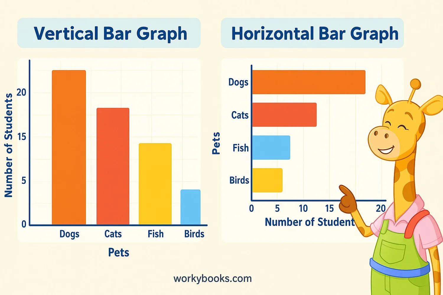
There are two main types of bar graphs:
1. Vertical Bar Graphs: The bars go upward from the bottom. We use these when we want to emphasize height or growth.
2. Horizontal Bar Graphs: The bars go sideways from the left. These work well when we have long category names or many categories.
Both types show the same information, just in different orientations. The choice depends on what makes the data easiest to understand.
Sometimes we also see:
• Stacked bar graphs - where each bar is divided into parts
• Grouped bar graphs - with clusters of bars for comparing multiple sets of data
Remember
Vertical bar graphs are more common, but horizontal ones are better when category names are long.
How to Read a Bar Graph
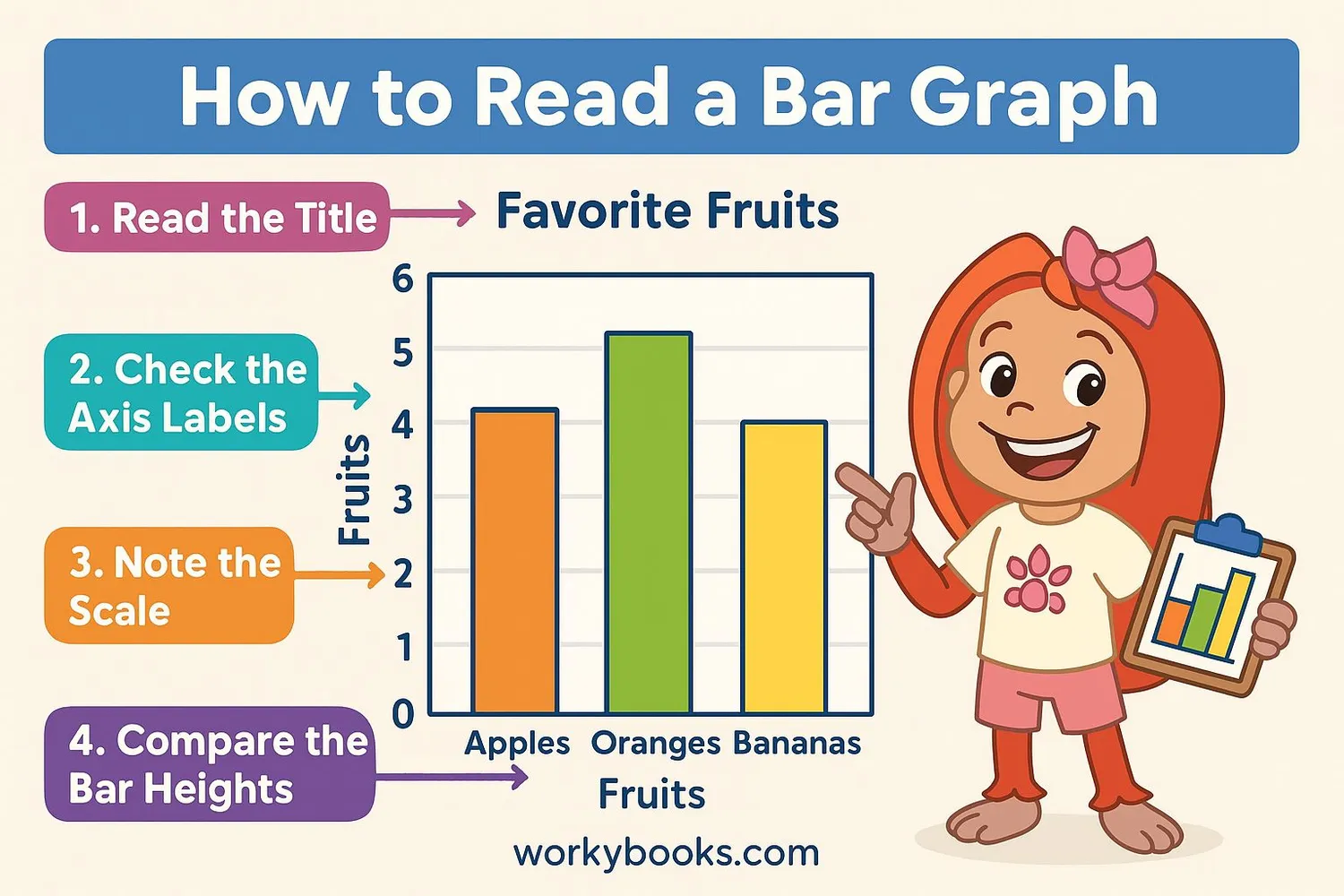
Reading a bar graph is easy when you follow these steps:
1. Look at the title - This tells you what the graph is about.
2. Check the axes - Find what each axis represents. The vertical axis usually shows numbers, and the horizontal axis shows categories.
3. Examine the scale - See how much each line or number on the vertical axis represents.
4. Compare the bars - See which bar is tallest (highest value) and shortest (lowest value).
5. Look for patterns - Notice if some categories are similar or very different.
Let's practice with an example: If a bar graph shows "Favorite School Subjects" with Math at 15, Science at 20, History at 10, and Art at 18, we can see Science is most popular and History is least popular.
Reading Tip
Always check the scale first - sometimes what looks like a big difference might only be a small change in numbers!
How to Create a Bar Graph
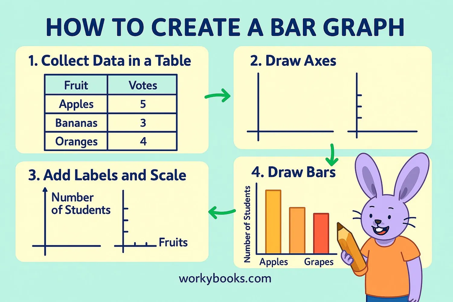
Creating your own bar graph is simple when you follow these steps:
1. Gather your data - Collect information and organize it in a table. For example, survey classmates about their favorite colors.
2. Choose your graph type - Decide if a vertical or horizontal bar graph works better for your data.
3. Draw the axes - Use a ruler to make straight lines for the x-axis (horizontal) and y-axis (vertical).
4. Add labels - Write what each axis represents (like "Favorite Colors" on x-axis and "Number of Students" on y-axis).
5. Create the scale - Decide how much each line on the y-axis will represent (like counting by 1s, 2s, or 5s).
6. Draw the bars - Make rectangles for each category, making sure their height matches the data.
7. Add a title - Give your graph a clear title that explains what it shows.
Remember to keep your graph neat and accurate so others can understand it easily!
Creation Tip
Make your bars equal width and leave space between them for a clean, professional look.
Bar Graph Practice Quiz
Test your knowledge with this 5-question quiz about bar graphs. Choose the best answer for each question.
Frequently Asked Questions
Here are answers to common questions about bar graphs:
Data Trivia
Discover interesting facts about graphs and data:
Oldest Known Graph
The first known bar graph was created in 1786 by William Playfair, a Scottish engineer. He also invented the line graph and pie chart!
Human Brain and Graphs
Our brains process visual information 60,000 times faster than text. That's why graphs help us understand data so quickly compared to reading numbers.
Graphs in Space
NASA scientists use bar graphs to compare data from different planets, like temperatures, atmospheric pressure, or the number of moons each planet has.
Largest Bar Graph
The world's largest bar graph was created in 2013 in Germany, measuring 1,200 square meters (about 3 basketball courts)! It showed energy usage data.
