
Horizontal Bar Graph - Definition, Examples, Quiz, FAQ, Trivia
Learn to represent data visually with horizontal bar graphs through explanations and practice activities
What is a Horizontal Bar Graph?
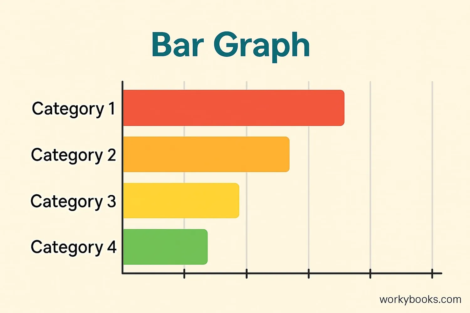
A horizontal bar graph is a way to show information using bars that go from left to right. It helps us compare different groups or categories.
The length of each bar shows the value for that category. Longer bars mean larger values, and shorter bars mean smaller values. This makes it easy to see which categories have more or less of something.
Horizontal bar graphs are especially useful when:
- You have long category names that need space
- You want to compare many different categories
- You're showing rankings or order
Key Concept
Horizontal bar graphs display categories on the vertical axis and values on the horizontal axis, making them ideal for comparing multiple categories.
How to Make a Horizontal Bar Graph
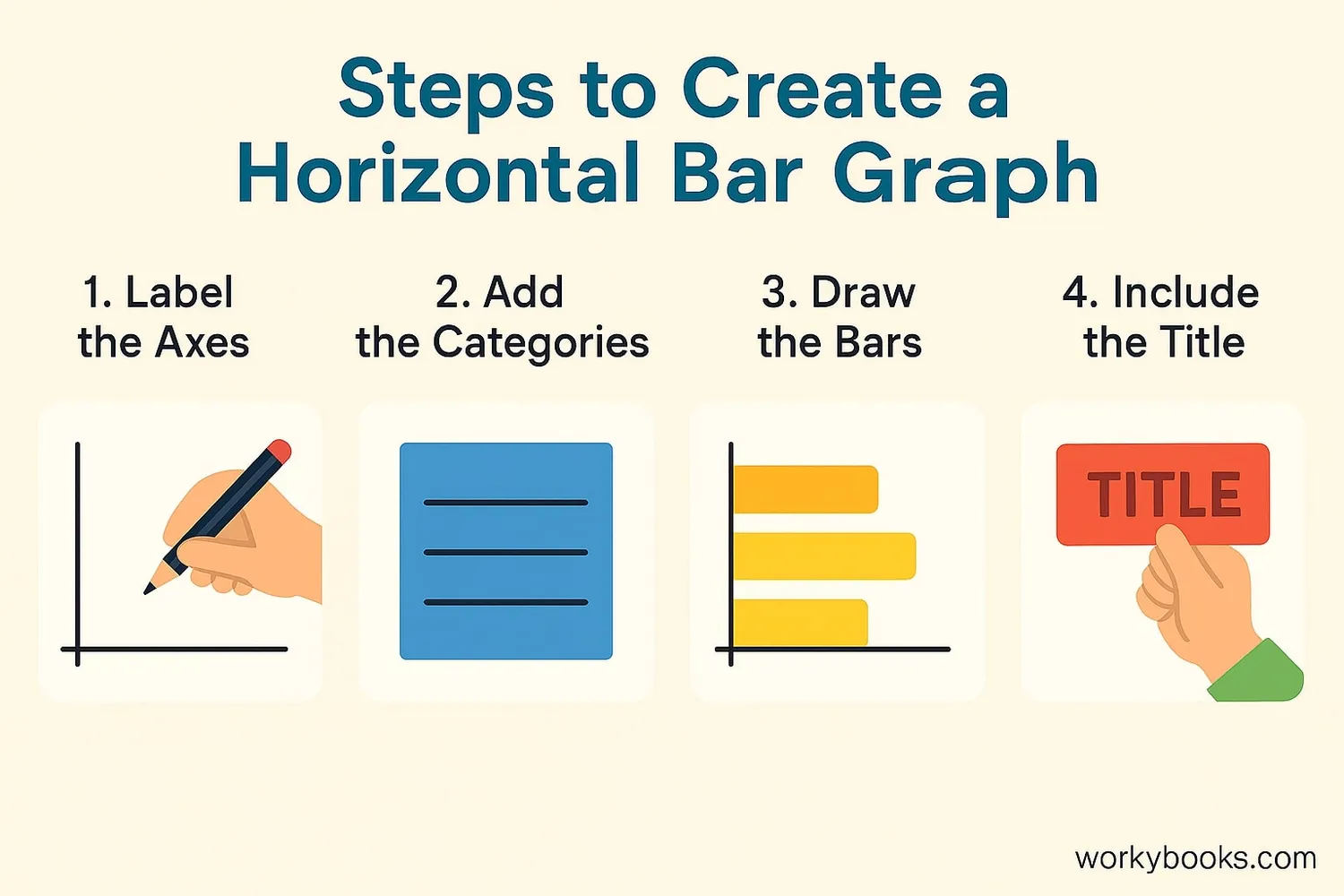
Creating a horizontal bar graph is simple when you follow these steps:
Collect Data
Gather information about different categories you want to compare.
Draw Axes
Draw a vertical line (y-axis) for categories and a horizontal line (x-axis) for values.
Label Axes
Write what each axis represents. Add a title for your graph.
Create Bars
Draw bars for each category. Make sure the length matches the value.
Important Rule
All bars should use the same scale so comparisons are accurate.
Remember
Always use a consistent scale on your value axis so your graph gives accurate information.
Horizontal Bar Graph Examples
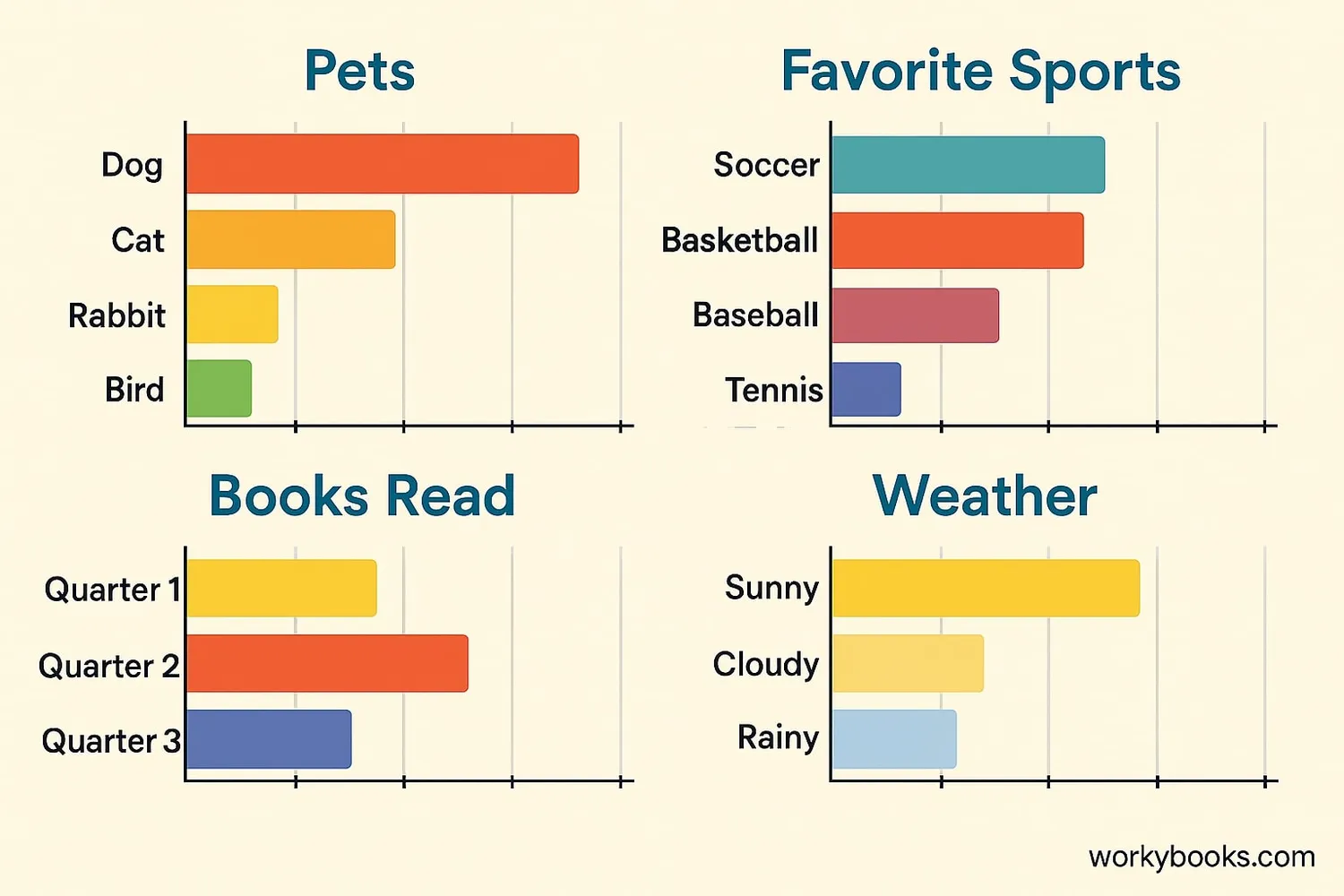
Horizontal bar graphs can be used to show many different types of information. Here are some examples:
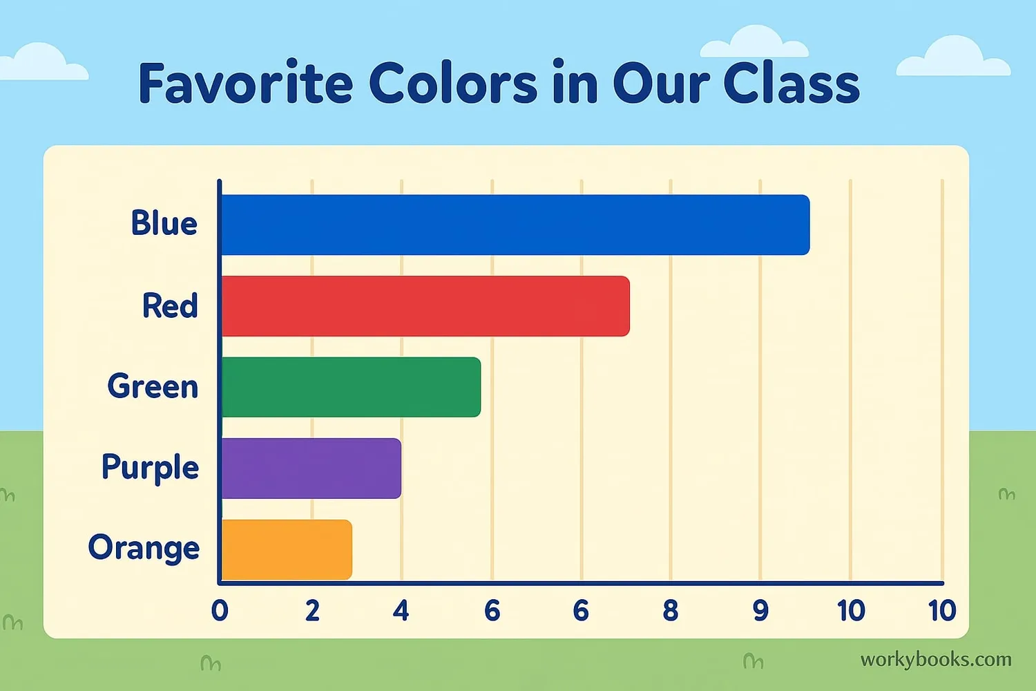
Example 1: Favorite Colors in Our Class
Example 2: Hours of Homework per Week
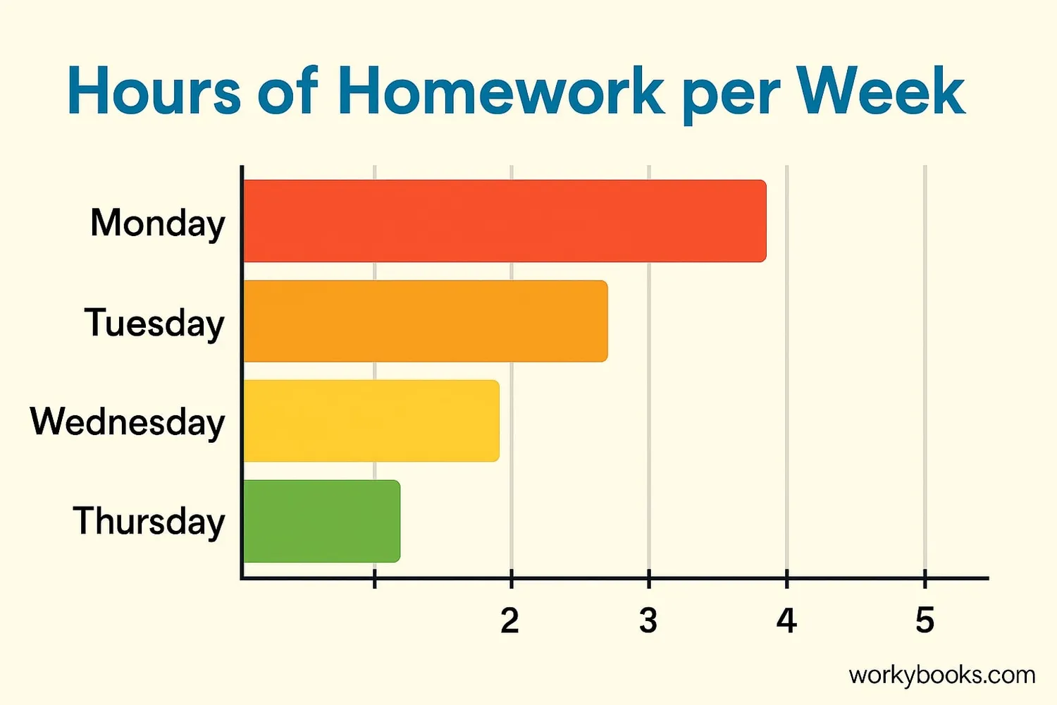
These examples show how horizontal bar graphs can help us quickly understand information. We can easily see which category has the most and which has the least.
Graph Tip
Use different colors for each bar to make your graph more visually appealing and easier to read.
Horizontal vs Vertical Bar Graphs
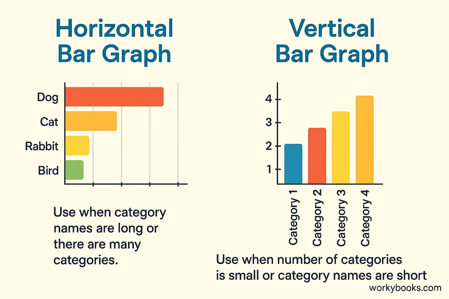
Both horizontal and vertical bar graphs show information using bars, but they have different strengths:
| Feature | Horizontal Bar Graph | Vertical Bar Graph |
|---|---|---|
| Best for | Comparing categories | Showing changes over time |
| Category labels | Easier to read long names | Limited space for labels |
| Many categories | Works well | Can become crowded |
| Time data | Not ideal | Works very well |
| Seeing small differences | Good | Excellent |
Choose a horizontal bar graph when you have many categories or long category names. Choose a vertical bar graph when you're showing changes over time.
Selection Tip
If your category names are long or you have many categories, a horizontal bar graph is usually the better choice.
Bar Graph Practice Quiz
Test your understanding of horizontal bar graphs with this 5-question quiz. Choose the correct answer for each question.
Frequently Asked Questions
Here are answers to common questions about horizontal bar graphs:
Data Representation Trivia
Discover interesting facts about graphs and data representation:
Ancient Graphs
The first known bar graphs were created in the 1780s by William Playfair, a Scottish engineer. He invented several types of graphs to make economic data easier to understand.
Brain Processing
Our brains process visual information 60,000 times faster than text! That's why graphs help us understand data much more quickly than reading numbers in a table.
Graphs in the Real World
Graphs are used everywhere! Weather forecasters use them to show temperature trends, businesses use them to track sales, and scientists use them to share research findings.
Digital Graphing
Before computers, people had to draw graphs by hand. Today, we can use spreadsheet programs like Excel to create graphs automatically from our data in seconds!
