
What Is a Population Map?
Interactive passage with audio narration, comprehension questions, and printable PDF.
By completing this purchase you agree to our Terms of Use and Privacy Policy. Your subscription renews automatically until you cancel. You can cancel anytime from your account settings. All sales are final and non-refundable. Digital content is available for download in your account immediately upon purchase.
What's included
What Is a Population Map? preview and details
About this printable What Is a Population Map? reading passage (Grades 3-7)
Sample passage and quiz from What Is a Population Map?
Reading passage and comprehension quiz preview
What Is a Population Map?
What Is a Population Map?
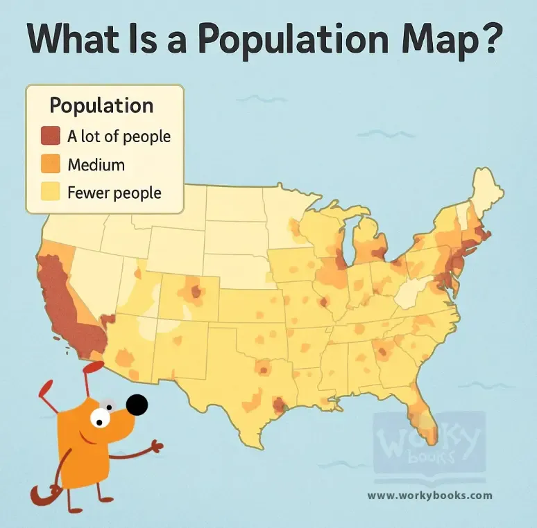
A population map is a special kind of map that shows where people live around the world or in a certain area. It helps us see which places are crowded with many people and which places have few or almost no people at all.
How Do Population Maps Show Information?
Population maps use different ways to show where people live. Sometimes, the map is color-coded—darker colors mean more people, and lighter colors mean fewer people. Other maps use dots, where each dot stands for a certain number of people, like 10,000. Some maps use shading, going from light to dark, to show how crowded an area is.
What Is Population Density?
Population density means how many people live in a specific area, like a square mile. Cities have high density because many people live close together. Rural areas have low density because people are spread out.
Patterns on Population Maps
Population maps show interesting patterns. Most people live near water, such as coasts and rivers. Cities look like dark clusters on the map. Places like mountains, deserts, and very cold areas have very few people. Farmland has a medium number of people. Some places, like Antarctica or the Sahara Desert, have almost no people at all.
Why Are Population Maps Important?
Population maps help city planners decide where to build schools and hospitals. Businesses use them to choose where to open stores. Governments use these maps to make sure resources go to the right places. Scientists use population maps to study how people affect the environment.
How to Read a Population Map
Always check the map’s legend to see what the colors, dots, or symbols mean. For example, a red dot might mean 50,000 people on one map but 100,000 on another. A population map is like a heat map of humans—the “hottest” areas are packed with people, while “cool” areas are nearly empty, showing exactly where everyone decided to live!
Interesting Fact: Half of the world’s population lives on just 1% of the land! Some cities have more people than entire countries.
Comprehension quiz (8 questions)
1. What does a population map show?
2. What does 'high density' mean?
3. What color would show more people?
4. Why do most people live near water?
5. How do businesses use population maps?
6. What does the legend on a map tell you?
7. Population maps only use colors. True or false?
8. What is population density?
Perfect for the way you teach
- Build comprehension skills
- Auto-graded quiz
- Differentiated reading
- Read together at home
- Improve fluency
- Quiet reading time
- Reading curriculum support
- Independent practice
- Track Lexile growth